Trailer App
Trailer App is an app we develop for a local cinema. we’re creating an app to attract, and retain customers (audience) and to allow them to book from the app. We want to create a product that can compete in the market and fill the gap to improve sales and increase customer satisfaction.

The Problem
Most trailer and cinema booking apps lack the function to integrate both to allow users to create a personalized experience.
The Goal
Design a trailer app that allows users to create profiles, customize their preferences, watch trailers and buy a ticket right from the app.
Responsibilities
My Role
UX designer designing an app for a local cinema from conception to delivery.
Conducting interviews, paper and digital wireframing, low and high-fidelity prototyping, conducting usability studies, accounting for accessibility, and iterating on designs.
Understanding the User
User Research Summary
I conducted interviews and created empathy maps to understand the users I’m
designing for and their needs. A primary user group identified through research
was working adults who are moviegoers.
This user group confirmed initial assumptions about the users, but research
also revealed that our users need the ability to have a customized experience/preference of newsfeed and the ability to change it anytime.
Other user problems included the need to add add-ons when buying tickets.
Pain Points
Experience: Users are not able to customize their preferences of movies.
Accessibility: Most apps do not support multiple languages
Experience: Most trailer apps don’t integrate ticket-buying services.
User Persona

Daniel's Problem statement
Daniel is a moviegoer young adult who needs a trailer app with options to customize preferences and buy a ticket from because he don’t want to use multiple apps for each service.
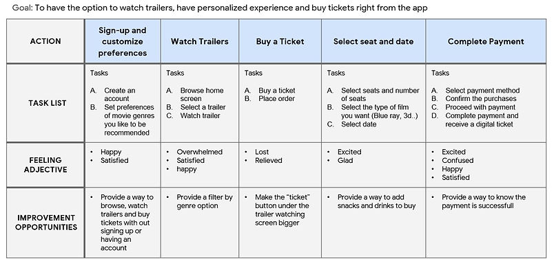
User Journey Map
Mapping our Trailer App’s user journey revealed how important it would make our customers experience more fun, personalized and very helpful having a dedicated Trailer App is.
Starting the Design
Paper Wireframes
Taking the time to draft iterations of each screen of the app on paper ensured that the elements that made it to digital wireframes would be well-suited to address user pain points. For the home screen, I prioritized on trending (new movies) trailers and the rest to be sorted by genre.

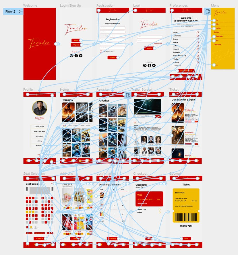
Digital Wireframe
As the initial design phase continued, I made sure to base screen designs on feedback and findings from user research.

A way to include Add-ons was something I found out our users needed to make their experience and purchase whole.

Low-fidelity Prototype
Using the completed set of digital wireframes, I created a low-fidelity prototype.

Usability Study
I conducted two rounds of usability studies. Findings from the first study helped guide the designs from wireframes to mockups. The second study used a high-fidelity prototype and revealed what aspects of the mockups needed refining.
Usability Study Parameters
Study Type: Unmoderated usability study
Location: Ethiopia, Remote
Participants: 5
Length: 20 - 40 min
Round 1 Usability Study Findings
1. Users want an app where they watch and buy ticket from
2. Users want to create a profile and have a personalized experience
3. Users want the option to add snacks and drinks when buying tickets
Round 2 Usability Study Findings
1. Users want bigger buttons
2. Users want the option to switch language
Refining the Design
Mockups
After the usability studies, I added the option to change language and preferences in the side bar menu.
Before usability study

After usability study

The second usability study revealed frustration with buttons not being visible and being outlined by a very thin line, so I changed them to be a solid colored icons.
Before usability study
After usability study

Some of the Other Screens

High-fidelity Prototype
The final high-fidelity prototype presented cleaner user flows for watching trailer, adding snacks, access to favorites and checkout. It also met user needs for language option.
Accessibility Considerations
1. Provided access to multiple language options for users who are not fluent in English or can't understand it.
2. Use icons that are easy to understand to help make navigation easier.
3. Used detailed and clear imagery in the Add-ons section so users can have a clear understanding of the snacks they are ordering.
Going Forward
Takeaways
Impact
“An app where I can watch trailers, have a customized experience and buy tickets with snacks and drinks is something I recommend for all,” said one of our users.
What I learned
While designing the Trailer app, I learned that usability studies, user research and peer feedback influenced each iteration of the app’s designs.
Next Steps
1. Conduct another round of usability studies to validate whether the pain points users experienced have been effectively addressed.
2. Conduct more user research to determine any new areas of need.
Let's Connect!
Thank you for your time reviewing my work on the Nutro App!
If you’d like to see more or would like to get in touch, my contact information is provided below.
Email: nebyat@email.com