Nutro App & Responsive Website
Nutro is an app and website that will help our users learn about nutrition, with blogs and important foods to eat with recipes they can cook for themselves.

The Problem
A lot of people don’t know about nutrition and nutrients. We identified a lack of general knowledge about nutritional diet and a limited understanding about it.
A lot of people don’t know about nutrition and nutrients. We identified a lack of general knowledge about nutritional diet and a limited understanding about it.
My Role
UX designer leading the app and responsive website design from conception to delivery
The Goal
Design an app and responsive website that will improve and educate about nutrition and help people eat healthy.
Responsibilities
Conducting interviews, paper and digital wireframing, low and high-fidelity prototyping, conducting usability studies, accounting for accessibility, iterating on designs, determining information architecture, and responsive design.
Understanding the User
User Research: Summary
I used Nutro App on nutrition to develop interview questions, which were then used to conduct user interviews. Most interview participants reported feeling worried about their nutrition intake, but they didn’t actively try to start a balanced/nutritional diet. The feedback received through research made it very clear that users would be open and willing to use our app and increase their knowledge about nutrition and start eating consciously.
User Personas

Dawit's Problem statement
Dawit is a Back-End Developer who is also a father of one boy who wants to be able to provide his kid with a nutritionally balanced diet so he will be healthy and the strong soccer player that he wishes to become.

Marta's Problem statement
Martha is an Accounts Manager with three kids. Who would love to have a platform where she can get nutrition information so she can be sure about her family’s diet.
Starting the Design
Digital Wireframes
After ideating and drafting some paper wireframes, I created the initial designs for the Nutro app. These designs focus on delivering personalized guidance to users.
Top half of home screen presents our users with the latest blogs and a discover section providing personalized recommendations for users

Easy access to app features from global navigation
Low-fidelity Prototype
To prepare for usability testing, I created a low-fidelity prototype that connected each screens.

Usability Study Parameters
Study Type: Unmoderated usability study
Location: Ethiopia, Remote
Participants: 5
Length: 30 - 60 min
Usability Study Findings
- People need to make “favorites” accessible from all screens and make it obvious.
- People need to make “Recipes” accessible from all screens and make it visible.
- All subjects needed a way to change between languages
Refining the Design
Mockups
Based on the insights from the usability studies, I applied design changes like providing a global navigation from the home screen to browse easily and a way to change language.
Before Usability Study


After Usability Study


High-fidelity Prototype
The high-fidelity prototype followed the same user flow as the low-fidelity prototype, including design changes made after the usability study.

Accessibility Considerations
1. Clear labels for interactive elements that can be read by screen readers.
2. Initial focus of the home screen on personalized recommendations helps define the primary task or action for the user.
3. The option to change language increases accessibility for users
Responsive Design
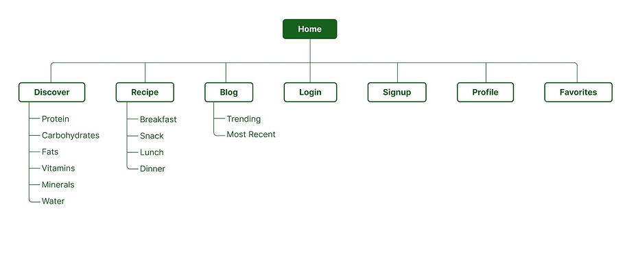
Sitemap
With the app designs completed, I started work on designing the responsive website. I used the Food Saver sitemap to guide the organizational structure of each screen’s design to ensure a cohesive and consistent experience across devices.
Responsive Designs


The designs for screen size variation included mobile, tablet, and desktop. I optimized the designs to fit specific user needs of each device and screen size.
Going Forward
Takeaways
Impact
Users shared that the app made them realize that they are not paying attention to what they are eating every day and in the process, they are happy to know that there is a product here to help them.
What I learned
I learned that diligently going through each step of the design process and aligning with specific user needs helps to come up with solutions that are both feasible and useful.
Next Steps
1. Conduct research on how successful the app is in reaching the goal.
2. Add more educational resources for users to learn from.
Let's Connect!
Thank you for your time reviewing my work on the Nutro App!
If you’d like to see more or would like to get in touch, my contact information is provided below.
Email: nebyat@email.com